Call to Action Best Practices
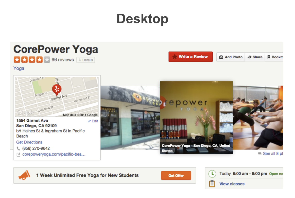
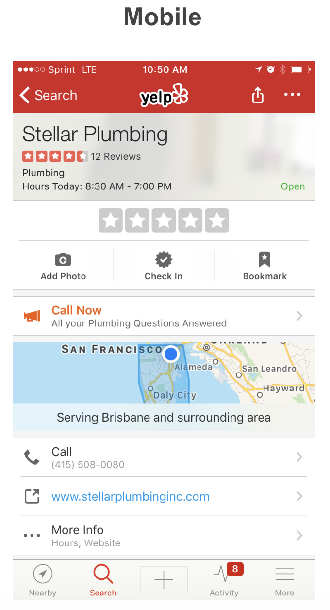
The Call to Action feature is a key selling point of a paid profile page; it is a message that invites customers to take a specific action, whether it’s trying a new menu item, checking out an in-store sale, or signing up for a trial membership. The message typically drives customers to a physical location. A CTA may be a more useful metric than a phone call or a mapped direction because it closes the loop between search and a transaction, providing measurable ROI.
General Guidelines
- Call to Action cannot link to an app download, or to a page that instantly redirects to an app download. A page which describes the offer/product and gives consumers option to click through to an app download is acceptable.
- Third party sites, e.g. Instagram, Facebook, are not permitted URL destinations. URL should lead to first-party website, e.g. business website.
- Third party deals are also not permitted, except Yelp Deal.
Avoid announcements, e.g. “Happy Hour 6pm Daily”. This is useful information, but isn’t a clickable event. CTA should encourage consumers to take an action. - Avoid legal “fine print” in CTA copy.
- Ensure there are no duplicate messages if a client is using a Platform service, e.g. a hotel profile page with a booking module should avoid CTA like “Book Hotel”.
Mobile
-
CTA Button: Customizable, 30 characters max
-
CTA Description: 50 characters max
-
Phone Number or URL
- URL max is 2000 characters
- Only digits, ASCII, and !”#$%&’()*+,-./:;<=>?@[]^_`{|}~ allowed
- Must start with http:// or https://
- Tracking parameters, e.g. call tracking numbers, are acceptable
-
CTA Button is the larger, shorter copy that appears in orange above the CTA Description. CTA Button should not be repetitive of CTA Description below, and makes sense when coupled together
-
CTA Button must state the action (e.g. Call Now, Reserve Now, Redeem Coupon) with a consistent destination. If the CTA Button on mobile says “call”, it must link to phone number
Desktop
-
CTA Button: Not customizable, see ‘CTA Button Text’ section below
-
CTA Description: 50 characters max
-
No new lines or brackets (<>)
-
No trademark, copyright, or special characters symbols
-
No more than 40% ratio of capital letters to lowercase letters
-
CTA Button should not be repetitive of the CTA Description
-
URL
- Max 2000 characters
- Only digits, ASCII, and !”#$%&’()*+,-./:;<=>?@[]^_`{|}~ allowed
- Must start with http:// or https://
- Tracking parameters are acceptable
-
CTA Button on desktop must match the destination. If the button says “Reserve Now”, the destination URL should link into a reservation form
Call To Action Button Text
Mobile CTA buttons can be customized. However, desktop CTAs must have the following values:
- “Apply Now"
- “Book Appointment"
- “Book Now”
- “Buy Tickets”
- “Check Availability”
- “Contact Us”
- “Enroll Now”
- “Get Directions"
- “Get Offer”
- “Get Quote”
- “Join Now”
- “Learn More”
- “Make Reservation”
- “Order Online”
- “Print Coupon”
- “Print Voucher”
- “Reserve Now”
- “Schedule Appointment”
- “View Now”
- “Visit Location”
Helpful Tips
- Active text like "Schedule Appointment", "Get Offer", or promotion led offers like "15% off boots for Yelp customers!" perform well.
- Introducing exclusivity is a great way to use CTAs for clients whose objective is to get customers into a location.
- The CTA can be used to call out a new offerings or promotions in the physical store. Similarly, it can be used to drive traffic online, e.g. to a website to sign up to a loyalty program, download a coupon for use in store, or another measurable web activity.
- Test URLs before passing through via API to make sure links function properly.
Other Helpful Resources
Call-To-Action Button By Category
Creating Content For Your Help Page


Updated over 4 years ago
